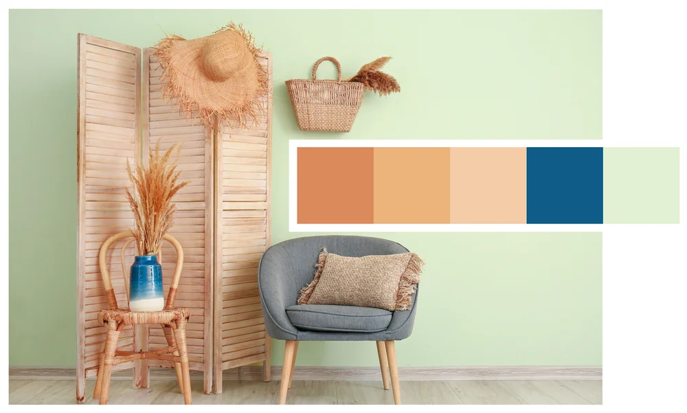
Top Color Combinations for Office Spaces
Blue and White
This classic combination promotes calmness and professionalism. Blue helps in maintaining focus, while white adds a sense of openness and cleanliness.
Green and Gray
Green is associated with nature and can have a calming effect. Paired with gray, it creates a balanced and modern look suitable for various office spaces.
Yellow and White
Yellow stimulates creativity and energy. Combined with white, it prevents the color from becoming too overwhelming, making it perfect for meeting rooms.
Red and Black
Red is bold and can energize the space, while black adds sophistication. This combination is ideal for creative industries where a bit of drama can spark innovation.
Orange and Gray
Orange is known for its stimulating and cheerful qualities. Paired with gray, it creates a balanced, modern look that is perfect for break rooms and collaborative spaces.
Recognizing and appreciating employees' efforts and achievements boosts morale and motivates them to maintain high performance. Regular recognition can take various forms, including verbal praise, awards, and incentives.
Color Combinations for Specific Office Types
Creative Offices
Creative offices thrive on bold and vibrant colors. Consider combinations like red and black or yellow and white to inspire innovation and excitement.
Corporate Offices
For corporate settings, opt for more subdued and professional colors. Blue and white or green and gray can create a calm and focused environment suitable for serious work.
Co-working Spaces
Co-working spaces benefit from a mix of stimulating and calming colors. Orange and gray, or yellow and white, can create a dynamic yet balanced atmosphere that caters to different working styles.
Home Offices
In home offices, personal preference plays a significant role. Choose colors that you find both inspiring and relaxing. Blue and white, or green and gray, are versatile options that suit various tasks.
Implementing Color Schemes
Painting Walls
One of the most effective ways to implement a color scheme is by painting the walls. Choose a dominant color for the main areas and accent colors for smaller spaces to create a cohesive look.
Workstations
For workstations, opt for colors that enhance focus and productivity, such as blue and green. Balance these with neutral shades to avoid overstimulation.
Furniture Choices
Furniture can also play a crucial role in your color scheme. Opt for furniture that complements your wall colors. For example, if you have blue walls, white or light wood furniture can create a harmonious look.
Accessories and Decor
Accessories and decor items like cushions, rugs, and artwork can add pops of color and tie the overall look together. Be mindful of not overloading the space with too many colors, as this can create visual clutter.
Tips for Maintaining a Balanced Color Scheme
Avoiding Overwhelming Colors
While bold colors can be stimulating, they can also become overwhelming if overused. Balance bright hues with neutral tones to create a harmonious look.
Balancing Bold and Neutral Tones
Mixing bold and neutral tones can help maintain a balanced color scheme. For example, if you choose a vibrant color like yellow, pair it with neutral colors like white or gray to prevent it from becoming too overpowering.
Incorporating Brand Colors
Incorporating your brand colors into the office design can create a cohesive look and reinforce your brand identity. Use brand colors in moderation to avoid overwhelming the space.
Common Mistakes to Avoid
Overusing Bright Colors
Bright colors can be energizing, but overusing them can create a chaotic environment. Use them as accents rather than the main color to maintain a balanced look. .
Ignoring Natural Light
Natural light can significantly affect how colors appear. Consider the amount of natural light in your office when choosing colors to ensure they look as intended.
Choosing the right color combination for your office can transform the workspace into a productive and enjoyable environment. By understanding color psychology and considering the specific needs of different office spaces, you can create a vibrant and efficient workplace. Remember to balance bold and neutral tones, incorporate brand colors, and consider employee preferences to achieve the best results.
Frequently Asked Questions
It's generally recommended to update your office color scheme every 5-7 years or when significant changes occur in your business or branding.
Avoid overly bright and distracting colors, like neon shades. These can be overwhelming and reduce productivity.
Yes, color can significantly impact mood and productivity. The right colors can enhance focus, creativity, and overall well-being.
Incorporate your brand's primary colors into the office design. Use them as accents or focal points to maintain a cohesive look.
Yes, there are various online tools and apps like Canva, Adobe Color, and ColorSnap that can help you visualize and choose the perfect color combinations for your office.
 style="translate: none; rotate: none; scale: none; opacity: 1; transform: translate(0px, 0%);">